I didn't have too many expectations coming into this course. I did originally say that I hoped it would help me find ways to try to incorporate art in the classroom. I feel like this may not have been the course for that, however it has given me some ideas on how I could tie it in with writing. For example, each time we created an artwork, you had us write a blog about our experience. I think this would be a great way to bring art into the classroom.
As in the beginning of this course I do not feel that I have a definition of what art is to me. That will continue to be a mystery, or maybe it really is not something to be specifically defined. I also don't have a favorite artist after all this! This course definitely opened my eyes up to all the art that is out there and I feel there are so many to choose from. I still need more time to explore the art world before i can choose a favorite artist.
As far as taking an online course, I feel the same as I did in the beginning. This is not the first online course that I have taken and feel very familiar with this method of learning. I love online courses because without them I would not be able to continue my education while working.
Friday, August 12, 2011
Self Portrait


 |
| Jean-Auguste-Dominique Ingres Joseph-Antoine Moltedo (born 1775) ca. 1810 Oil on canvas 29 5/8 X 22 7/8 in |
 |
| Masaccio Self Portrait 1420 338X480px |
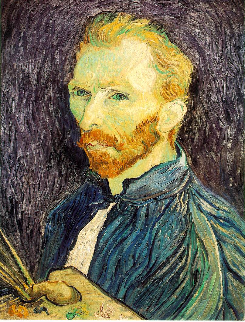 |
| Vincent van Gogh Self Portrait 1889 Oil on canvas 25 1/2 X 21 1/4 in |


I chose the three inspirational pieces that I chose because each of them were different. Although they are all self portraits, each artist approached it differently. As I have mentioned before in previous blogs, I have chosen to use pencil because it is the medium that I am most familiar with and that I find easiest to use. The most challenging part of creating a self portrait for me was getting it to look like me! I guess the way I addressed that challenge was by erasing and redrawing my lines until it looked more like the original picture.
I would say that this piece represents me in its simplicity. Also, the fact that I chose pencil represents my continuous changing quality. What I mean by that is that pencil is a medium you can always go back and alter. It is similar to the way I am as a person. I am a constant work in progress. I always look for things I can go back and change or improve upon as a person. I tried to apply the principle of value and emphasis in this picture by shading certain areas. I wanted to stay true to the shadows of certain lines in my face.
I don't think I did too bad and I'm fairly pleased with the finish product. I know it doesn't look exactly like me, but if I were to continue working on it over time, I think it would improve. Not bad for a first attempt I would say.
Art Criticism Article
Before choosing which exhibit I wanted to criticize, I looked at four of my peers projects. The four projects I reviewed were I Want to be Inspired by Joanna Limpert, Project # 4, by Tara Boliard, What a "Colorful" World: A look at Pop Art by Shawkimah Jordan and Nature Through Our Eyes: How humans see and perceive the natural world around us by Tracy-Anne King. I had a hard time choosing between Jordan and King, so I critiqued both of them!
I selected the two of them because I really enjoyed their presentations. Each of them did an excellent job choosing artwork that really suited their themes. Their exhibits also had good aesthetics. They also gave good descriptions of the art and why they chose their pieces.
I wouldn't say that I found anything specific to be difficult when writing my article. I just wrote what i honestly felt and though about their work. I think I would like to read the articles my peers wrote about my project to see what I could have done better. As far as my article goes, I would give it an 8 on a scale of 1-10. I know it wasn't perfect, but i think my comments were fair and relevant to the assignment.
Overall, I did enjoy working on this project. However, it was difficult finding enough images to make up the 20 slides.
Wednesday, August 10, 2011
Art Criticism Video Blog
In the "Greenburg on Pollock" video talked a lot about the artist. The background information it gave was very key. If I were to be creating an exhibit that included works of this artist, this is the type of stuff I would want to know. They spoke a lot of t Pollock's attitude towards eisel paintings. That would make me take into consideration what type of works I would place near his work out of respect for the artist.
"The Critics: Stories from the Inside Pages" gave a lot of insight on the role critics play. One gentleman said something along the lines of "your're helping the art of your time to gain new readers." I felt that statement was true to what our role as curators was in the last project. We had to become critics oursleves first, so that we could productively select works to display in our exhibits. The way in which we display the works as curators is crucial to how it will be read and criticized by its viewers. Critics are the ones that get us to stop and look at things. But as curators we have to think ahead of the critics and think like them. Essentially curators have to keep the critics happy. Otherwise it can affect the view they have on the work of the artist being displayed.
In "The Colonial Encounter" video was also very interesting. This video talked about art that has been ignored. A great way for people to be exposed to these rare arts would be for curators to research them and create exhibits using that art. I think that when curators try to go outside the realms of what is already familiar in the art world that a door to a whole new world can be opened.
Sunday, August 7, 2011
Art Curator Project
Well...This was a very tough task for me but I did it! At first I thought I should expect to run into some difficulty finding images to fit the theme of time. But I wasn't expecting it to be this difficult! The thing that was the hardest was to find enough images. Also, as I got farther into the project there were fewer options and less information available on those specific works.
Overall, I feel I did fairly well. I wanted to make sure that I didn't just chose works with the obvious representation of time. I wanted to chose pieces that would really make the viewer think about it. I also had to think anout the background I chose to use in my power point. Although it was not a real exhibit, I found that certain colors and patterns made it difficult to see or focus on the images. Therefore, I chose a soft gray for the template background.
Overall, I feel I did fairly well. I wanted to make sure that I didn't just chose works with the obvious representation of time. I wanted to chose pieces that would really make the viewer think about it. I also had to think anout the background I chose to use in my power point. Although it was not a real exhibit, I found that certain colors and patterns made it difficult to see or focus on the images. Therefore, I chose a soft gray for the template background.
Wednesday, August 3, 2011
Art Exhibition Project Videos
The first video about lowbrown art ties in nicely to the project. They explained what the term means and where it came from, then you could see art that would be placed in that category.Also, the descriptions being given were done by gallery curators, whic is essentially the role we will be playing in the creation of our projects. It kind of helped serve as another example of a theme that could be used for this project.
The second video spoke specifically about the approach the Tate curators use in their form of displaying art. They created four different sections each with a specific them to display the works. These themes were also displayed consisting of artworks of different time periods as well as materials and artists.
OK...The video about the Native American bones was very informational, but bored me to death. I couldn't quite make the connection to the project with this one and had a hard time focusing on what was going on.
I liked the video about the George Eastman House. I live in Rochester, NY and have been there many times. The theme of the collections in this museum are film and photography. The video was another supplement to the idea of different themes that we could develop as curators for our projects, as well as the process that is gone through in doing so.
Friday, July 29, 2011
Modern and Postmodern
I chose the video titled "Uncertainty:Modernidity and Art" because as I have read and from my personal experiences, it was evident that the modernidity of art can sometimes confuse the viewer. This is because modern art communicates so many different things. There no longer is one simple code that we follow with art. I like how the video goes into depth discussing the many uncertainties created by our modern art. One key point that stuck with me from this video was that "modern art never stops changing, but keeps keeps responding to the same problem, modern living."
The second video I chose was "Andy Warhol: Images of an Image" because I found the idea suggested by this title to be interesting and was curious to find out what it referred to. This video discussed the many techniques and works of Andy Warhol. He did a lot of works where he repeated images, a lot of which were commercial advertisements and celebrities. He was well known for his silk screens such as the work titled "Ten Lizes."
The second video I chose was "Andy Warhol: Images of an Image" because I found the idea suggested by this title to be interesting and was curious to find out what it referred to. This video discussed the many techniques and works of Andy Warhol. He did a lot of works where he repeated images, a lot of which were commercial advertisements and celebrities. He was well known for his silk screens such as the work titled "Ten Lizes."
The Modern World 1800-1945 Videos
The two videos I chose to watch were "A Sunday on La Grande Jatte" and "Dada and Surrealism." I Chose them because they were both mentioned in topics I found interesting while doing the readings. "A Sunday on La Grande Jatte" was a part of the post-impressionism movement and the other video included the word Dada in the title which I was intrigued by because those artists were pretty much anti everything!
Like the video, the text did not give me the impression that Seurat's painting was so controversal. It was nice to see and hear the reaction of real people towards the painting. They also shared some of their interpretations of the painting which made me think of ideas I did not think of before. They also gave alot of insight into the background of the artist. I never would have thought the woman fishing could be a prostitute in disguise or that the monkey suggesting there may be some "monkey business afoot."It was interesting to discover that he lived just two streets away from his mother with his lover and son, yet kept their existance a secret. He did a lot of landscapes with common subjects like fishermen. Seurat went through such a process to create this painting, even going to the park to paint an image of the background without any subjects in it. The video tells us that it took him a total of 10 months to complete this work.
In the second video about Dada and Surrealism it was nice to learn of some of the other artists involved in these movements as well as examples of their works. This too served as a nice suppliment to what we read in the textbook. The first artist mentioned, Schwitters was categorized as a dadaist yet considered himslef to be the opposite of that. But the video gives examples and explanations of his works that show how he would be considered a dadaist.
Sunday, July 24, 2011
Mask Making
The first mask I selected for inspiration is the Lwalwa mask. This type of mask were used as dancing masks and in celebration ceremonies. They used geometric shapes to represent facial features such as the eyes and mouth. The colors of the mask are very monochromatic, yet there are different values of the brown color. You can also see that the headdress has pattern as well as texture.
 Next, I chose the Yohure mask. They too were used in dance ceremonies, but also to help the community deal with the death of a tribe member.They combine both animal and human features in their masks. There is the element of repetition with the pattern of white triangles on either side of the forehead and face. There is also emphasis placed on the forehead and mouth/nose area with a lighter shading of white over the dark brown.


 I am not into magic and witchcraft, but the idea of my mask came from what I read in the textbook. The Africans created masks to scare young men into respecting their elders or for people to treat the handicapped well. I created mine to remind us that we need to take care of our planet, or else our ozone layer will continue to become thinner and the suns rays more powerful.
I enjoyed the mask making process as well as reading and learning more about the art of making masks. I would have liked to have gone out and bought better materials to make a more elaborate mask, but did not have the means to do so right now. But I feel that i successfully created a mask that embodied some of the characteristics and elements of the masks I chose for inspiration.


The third type of mask I looked at was the Baule mask. This was used in a dance festival during the harvest season. The circular face gives the element of movement in the way that it was used to symbolize the life-giving force of the sun.

Below are my sketches for my mask. I chose to use geometric shapes for the eyes and mouth. I knew I wanted to do something with the sun; I just couldn't help myself with the heat we have been having.

To add the 3-D element I had the rays projecting from the face of the mask in the final mask instead of fanning out around it.


I enjoyed the mask making process as well as reading and learning more about the art of making masks. I would have liked to have gone out and bought better materials to make a more elaborate mask, but did not have the means to do so right now. But I feel that i successfully created a mask that embodied some of the characteristics and elements of the masks I chose for inspiration.
Saturday, July 23, 2011
Video Review
Why I Chose these Videos
The four videos I chose were "Islamic Art: India and the Middle East", "African Art: Legacy of Opression", "Chinese Art: Treasures of the National Palace Museum", and "The Great Wave (Japanese Art)". I chose each of these because they were all about a different culture of art.
Islamic Art: India and the Middle East
I find the Islamic culture to be quite fascinating, which is what made this video a top pick for me. The readings we did this week taught me things about the story of Islam that I did not know before, and sparked my interest in their art. Both the text and the video mention the Taj Mahal, which is one place I have always wanted to visit since the first time I saw it in a photo back in middle school. They way that they use geometric shapes and create such beautiful structures with perfect symmetyries amaze me. The narrator speaks of the "desire for paradise" of the islamic people, which I also found interesting. This paradise is evident in the beauty of the palaces and mosaics.
Another thing metioned in the readings and the video is the importance of the courtyard area. They use it to prepare food, to pray and other things. It creates a sense of community. I never know that they face a specific wall that shows the direction to mecca until now. I like the information that the video gave about Damascus. The entire city is facing an "electronic mecca", which is a satelltie dish that broadcasts their prayer throughout the day. He also explores the question of how one would know where mecca was. He showed the idfferent instruments of their science they would use to determine where mecca was.
One key fact that he did mention was that nowhere in the Koran does it say that an artist cannot create images of people, but rather that it was frowned upon to show idols in a religious context; which is similar to what the text says. He went into depth to explain how it was Judaism that created this commandment.
African Art: Legacy of Opression
In the beginning of this film they mentioned that in the congo region, there were more than 230 different cultures. This alone was an astonishing fact. It was interesting to hear about how their pieces were consider to be somewhat magical and that many of the peices they created even had openings to hold containers or magical potions to make them more potent. Also, they used masks to scare people so that they would treat the handicap nicely or for young men to respect their elders. I did not know that it was their encounters with the weaponry of the westerners that caused them to stop making masks to intimidate their enemies because they realized the magic did not work.
Chinese Art: Treasures of the National Palace Museum
In Chinese art, there were many artistically made everyday objects such as the tea cup jar vessel and chicken bowl. They use a lot of dragon motifs in their worl which is a significant part of their culture. This video imparticular focused more on specific works and the dynasties they originated from. The vessel for warming wine seemed to hold great importance in this culture. An interesting fact was how the glaze blue used on porcelain became poplular in the Ming dynasty. Spots of dark blue and black are a distinct characteristic of their pottery which was aonther feature I was not aware of.
The Great Wave (Japanese Art)
I had no idea that a wave was the best known image in Japanese art, and would not have ever understood why before viewing this video. It was its representation of the natural world that intrigued people. It was kind of crazy to see how much influence this single image had. It was used in a designer's line in 2003 and others have tatooed it onto their bodies!
Overall, the first two video had the most relation to the text and were a great suppliment to what we read about in the text. That does not mean that I did not still learn great things from the others. I am a visual person, so it was nice to have a visual image to go along with everything the narrators were discussing. But, the text does also offer great photographs too.
Sunday, July 17, 2011
Exploring Line


Friday, July 8, 2011
Video Review
I was not able to view any of the videos in their entirety due to issues with them freezing up and skipping no matter what I tried. So, I will discuss briefly what I got from this week’s readings. In Chapters Fourteen and Fifteen I learned about how many of the art we see now has been influenced by the art of the past. I never knew about how Egyptian art was known for is stability in how they kept the same traditions and style. I also was able to see how their art influenced the art of the Romans. If I had been able to view the videos I feel they would have gone into more detail into how these different cultures influenced one another, breaking down what we learned in the readings.
Peer Responses to Artwork
The two blogs I chose were of Lydia Merlo at: http://lydiamerlo.blogspot.com/search?updated-max=2011-06-17T18%3A22%3A00-07%3A00&max-results=7 and Jessica Marchetti at : http://jmarch7588.blogspot.com/2011/06/channeling-my-inner-artist.html?showComment=1310155465660#c3036671276256351404
For project # 1 it was interesting to see the unique way that each of them found the elements in nature and household items. Each of us had some similarities in our approach to the assignment, yet we each brought something different to the table too.
For project #2, neither of them had the same images as me because I live in Rochester, NY and went to a different museum. However, they both chose “The Marvelous Sauce.” Jessica chose it because it reminded her of growing up in an Italian household. Lydia chose it because she was drawn in by its detail and preciseness.
There was one piece in particular that really piqued my interest. It was “Indefinite Divisibility” from Jessica’s visit to the gallery. I liked this piece because of its striking similarity to “Clocks Melting Clocks” by Salvador Dali. What I would like to know about this painting is why the artist created it, and if they were at all influenced by the work of Dali.
What I did find interesting about reading my peers reflections was more so the differences rather than similarities in their though processes. This was definitely what made this valuable to my learning experience because it gives me a new way to go back and think about some of my own reflections. It’s like being given a new pair of eyes. Reading the comments of my peers was helpful in that t showed me that I was on the right track in my though process, but also that there really was no “wrong” way to go about it.
Sunday, July 3, 2011
Architecture
The video I watched was “Imperial Rome, Ostia, and Portus: Ancient Architecture and Technology.” This video discussed how the Romans used local quarried materials to create architecture that served specific functions throughout the empire. I switched from wood to stone to preserve bridges and buildings. They had a system of aqueducts that was specifically constructed to function with the large arches used to carry the water that supplied the empire during the imperial period. This reminded me of how the reading talked about how the environment in which a piece of architecture is to be erected dictates and influences the materials that an artist will use.
It was quite intriguing to see how these structures that we see so much beauty and art in when we visit these places were really created with great purpose to serve specific functions. In this week’s readings, the text book talked about the importance of knowing the background of artists and their culture to better understand their works. This is exactly what I felt this video did, and was also the reason I chose it. I was interested in learning of how everything the constructed was related to their surroundings and how their environment was taken into consideration when they constructed these structures. With this knowledge, I was able to view the empire in a completely different light.
Sculpture, Ceramics, Installation
In the “Through the eyes of the sculptor” video, the key elements I learned from this video were how the artists will move away from where they live in order to learn more about where they are from. Learning about where their culture plays an important part in the works they create; this was also mentioned in this week’s readings. I also never knew about restoration artists and how they are rarely asked to carve an entire sculpture. The role that they play is a very interesting one. I also liked the fact that most sculptors work on more than one piece at a time to keep their ideas fresh. It makes sense to me. It just like when I am working on multiple papers, I will take a break from one, start another and then return to the first to give my mind a break and refresh my thoughts on that topic. I love the way that Emmanuel Fillion describes the sculpting process. He says, “A sculpture comes alive in clay, dies in plaster and is reborn in marble.” The process is truly intricate and fascinating.
The “Glass and Ceramics” video broke down the process of how glass was made. I really liked the fact that they explained and depicted what happens to the sand and other components that are added when it is being heated. I had no idea that ceramic materials can be stronger than steel! That was another thing I found to be quite interesting. We see how glass is used in “green architecture” due to its ability to keep in the coolness in air conditioned buildings as well as reinforce heat instillation. Throughout this video they start off speaking of glass as more of an art form and then transition into its usefulness, thus being the craft of creating glass.
I never knew that Installation Art was so controversial and would never have understood why if not for this video. The works of Richard Wilson are very interesting. I like the way he pushes the boundaries. I would have to say that Instillation Art just might be my favorite type of art. This is because I like the idea of art not being confined to the indoor setting of a gallery but rather created in a grand scale to interact with the outdoor environment.
Sunday, June 26, 2011
My Visit to the Memorial Art Gallery
All of the artwork that I saw at the Memorial Art Gallery here in Rochester, NY was wonderful! I was born and raised here, and in my 23 years of life here have never been to this gallery! It was truly an amazing experience. All of the pictures I uploaded were the pieces that impressed me the most. That is why I chose to take pictures of these specific pieces. There was also a new exhibit called "Fiber Art International" which was by far my absolute favorite. But, unfortunately they did not allow us to take photos in this exhibit. Some images of the fiber art exhibit can be viewed at http://fiberartinternational.org/exhibits. I really enjoyed Sara Nissims "Children of the World" (from fiber art exhibit). She hand wove and embroidered this piece with metallic and cotton threads of many different colors. It was very stimulating to look at.Out of all the pieces I saw today, Jacob Lawrence's "Summer Street Scene in Harlem" made the greatest impression on me. I would say it is because he did a marvelous job in reproducing the energy of what it would feel like to be in the streets of Harlem on a summer day. The pastels are still soft yet vibrant all at the same time. You can see the movement of the people in the way their bodies are positioned on the canvas. Another piece that was cool was Devorah Sperber's artwork. Her piece was made entirely of hundreds of spools of thread! With the human eye it was more difficult to make out the image, especially because it is upside-down. But when I took a picture of it, the image was more clear and I was able to make out the shape of a man and a woman.
The piece i felt a connection with is Robert Lee MacCameron's "New Orleans Man." The thing that drew me in to this painting was how familiar the artist made the man seem. He had this real, warm, inviting smile and expression on his face. It was almost as if I was standing in front of someone I knew. I loved how he softly blended the man's shadows and the colors of his jacket. I also felt a connection to Trautmann's "Galaxy" and Gwathmey's "Non-Fiction." I connected with the colors of "Galaxy" because it seemed to have a lot of personality. It reminded me of myself somehow if that makes sense. When looking at "Non-Fiction" you can't help but feel or at least sense the emotion on the little girl's face. The title and image are quite puzzling, and for that reason it is also a piece I would like to know more about.
"Landscape with Garage Light's" is another one that puzzled me. I want to know what exactly the author trying to say or show by creating this piece. Lastly, going back to my friend, "The New Orleans Man," I want to know who he is and what the artist chose to draw him. Below is the link to a slideshow of all of these images. I attempted to share it directly to blogger by following the steps in the powerpoint, but it kept giving me the same errors.
http://s1179.photobucket.com/albums/x394/sramsay87/Memorial%20Art%20Gallery%20Visit/
Friday, June 24, 2011
My Logo: The Love of Learning is What Keeps You Earning
Creating this logo was fun for me. Although I don't consider myself to be the most artistic person, I feel I was able to effectively represent myself with this logo. The thing that helped me the most was a tip I found in the D.I.Y. Lupton document. It said, "The first ideas that come into your head are generally ideas you have experienced before." I found that to be very true. So, I sat and thought about it and the idea just popped up in my mind. I know that I love learning and that without my education i wouldn't be able to earn the things I want in life. This is the idea that I always try to present to my second graders when they don't feel like trying or caring about their education. So that is where the sketches I began to draw in the second image at the bottom of this blog came from.
As my creative thinking techniques I used mind mapping, brainstorming and the buzz word technique. The words I thought of were "learning", "love" and "earning". Then another suggestion form the same document came to my mind again. It said to "combine letter forms with graphic elements." So then I tried to think of how I could somehow put the three together to create a single image.
The most important discovery I made in the creation of my logo was how much easier it became for me once I started to think less and just draw more. I just let whatever came to mind flow out on my paper. As far as what I found to be interesting or important from the videos, i would say it was just how much goes into producing these logos and brands. They were so detailed in their methods and you could see just how much really goes into the whole process.


Saturday, June 18, 2011
Color Theory, Value Scale and Color Wheel
Creating the value scale and color wheel were fun but difficult. I found the value scale was the easier task. However, the difficult part was getting my squares to gradually get lighter. When it came to the color wheel...something went terribly wrong! I went to several different art stores and none had cyan, so I got the closest thing to it. But when I had to mix the three primary colors to make black, it came out more of a brown color.
The media I enjoyed working with the most was the pencil. I liked it because I was able to manipulate and control the outcome more. I could press hard to get a darker line, or lighter for the opposite. I also was able to use my finger to blend and shade.
The most important discovery I made in creating these color wheel is the importance of having the right shade of blue. From the video I learned that you can't just mix half-and-half with the primary colors to create the secondary colors.
![]()
![]()
The media I enjoyed working with the most was the pencil. I liked it because I was able to manipulate and control the outcome more. I could press hard to get a darker line, or lighter for the opposite. I also was able to use my finger to blend and shade.
The most important discovery I made in creating these color wheel is the importance of having the right shade of blue. From the video I learned that you can't just mix half-and-half with the primary colors to create the secondary colors.


Saturday, June 11, 2011
Elements and Principles
Below I have included a link to a slideshow I created. In the slideshow are various images that show the different elements and principles of art. I have always enjoyed the work of photogrophers who take pictures of items they find around them in every day life. Therefore, I tried to mimic their style of photography by taking pictures of various things around in my home. I hope you enjoy the images I have created.
<div style="width:480px; text-align: center;"><embed type="application/x-shockwave-flash" wmode="transparent" src="http://w1179.photobucket.com/pbwidget.swf?pbwurl=http%3A%2F%2Fw1179.photobucket.com%2Falbums%2Fx394%2Fsramsay87%2F874afb89.pbw" height="360" width="480"><a href="http://photobucket.com/slideshows" target="_blank"><img src="http://pic.photobucket.com/slideshows/btn.gif" style="float:left;border-width: 0;" ></a><a href="http://s1179.photobucket.com/albums/x394/sramsay87/?action=view&current=874afb89.pbw" target="_blank"><img src="http://pic.photobucket.com/slideshows/btn_viewallimages.gif" style="float:left;border-width: 0;" ></a></div>
<div style="width:480px; text-align: center;"><embed type="application/x-shockwave-flash" wmode="transparent" src="http://w1179.photobucket.com/pbwidget.swf?pbwurl=http%3A%2F%2Fw1179.photobucket.com%2Falbums%2Fx394%2Fsramsay87%2F874afb89.pbw" height="360" width="480"><a href="http://photobucket.com/slideshows" target="_blank"><img src="http://pic.photobucket.com/slideshows/btn.gif" style="float:left;border-width: 0;" ></a><a href="http://s1179.photobucket.com/albums/x394/sramsay87/?action=view&current=874afb89.pbw" target="_blank"><img src="http://pic.photobucket.com/slideshows/btn_viewallimages.gif" style="float:left;border-width: 0;" ></a></div>
Color Theory and Emotional Effects: Elements and Principles
In the first video about color, the narrator says, " color has a powerful and unpredictable effect on our emotions." I could not agree more with that statement. There are so many different hues and shades. The way in which an artist blends different colors, and the intesity of those colors used, all have an effect on how we respond to them emotionally. Each individual person has what is called a direct emotional response to color.As mentioned in chapter four, color is something that people take pleasure in. I love the color green, and tend to gravitate towards objects and works of art that use that color. The color green makes me feel happy, calm and energized all at the same time. But someone else who detests the color green will feel differently. One key statement that June Redfern made when she was finishing her painting was, "It's a very psycological thing actually, color... It has lots of meanings, sybols and ideas behind it... It's how you feel, and it's the feeling that color evokes you have to hang on to."
<div style="width:480px; text-align: center;"><embed type="application/x-shockwave-flash" wmode="transparent" src="http://w1179.photobucket.com/pbwidget.swf?pbwurl=http%3A%2F%2Fw1179.photobucket.com%2Falbums%2Fx394%2Fsramsay87%2F874afb89.pbw" height="360" width="480"><a href="http://photobucket.com/slideshows" target="_blank"><img src="http://pic.photobucket.com/slideshows/btn.gif" style="float:left;border-width: 0;" ></a><a href="http://s1179.photobucket.com/albums/x394/sramsay87/?action=view&current=874afb89.pbw" target="_blank"><img src="http://pic.photobucket.com/slideshows/btn_viewallimages.gif" style="float:left;border-width: 0;" ></a></div>
<div style="width:480px; text-align: center;"><embed type="application/x-shockwave-flash" wmode="transparent" src="http://w1179.photobucket.com/pbwidget.swf?pbwurl=http%3A%2F%2Fw1179.photobucket.com%2Falbums%2Fx394%2Fsramsay87%2F874afb89.pbw" height="360" width="480"><a href="http://photobucket.com/slideshows" target="_blank"><img src="http://pic.photobucket.com/slideshows/btn.gif" style="float:left;border-width: 0;" ></a><a href="http://s1179.photobucket.com/albums/x394/sramsay87/?action=view&current=874afb89.pbw" target="_blank"><img src="http://pic.photobucket.com/slideshows/btn_viewallimages.gif" style="float:left;border-width: 0;" ></a></div>
Sunday, June 5, 2011
Video Review
One of the key concepts I learned from the first video on aesthetics was form a philosopher of the 18th century, Imannuel Kant. His theory was on how there is no exact science of the beautiful. His made the most sense to me because not everyone will react the same or experience any one image the same way. In the second video however, I was not able to take much away from. I have a difficult time with accents, and his was very strong, so it was hard for me to focus on what he was saying. However, he did mention that we have a bottom up processing of visual images emotions and feelings. I never noticed before now how true that is. Whenever I look at a picture of structure, my eyes always scan from the bottom to the top. As my eyes continue to move upward, the more the emoting or feeling that object evokes in me increases or becomes stronger. The videos relate to the readings because they go into more depth on the origin and meaning of aesthetics. The first video is more about the theory and history of it, and the second takes more a scientific approach to break it all down. They were both definitely a great supplement to the chapters we read during the week.
Saturday, June 4, 2011
My First Blog for AED 200
So, I just set up my Gmail account and I'm writing my first blog now. I must say that the process of both setting up the Gmail account and creating a blog were quite easy. In this course i expect to learn more about art in a way that will help me to read deeper into specific works or art and to discover its importance. I am excited about taking an online course because it affords me the convenience of continuing my studies without having to drive all the way to Buffalo. I currently live in Rochester, NY, and I am a non-traditional learner in the Bridge to Teaching program. I look forward to getting to know all of you throughout this course.
Subscribe to:
Comments (Atom)