I didn't have too many expectations coming into this course. I did originally say that I hoped it would help me find ways to try to incorporate art in the classroom. I feel like this may not have been the course for that, however it has given me some ideas on how I could tie it in with writing. For example, each time we created an artwork, you had us write a blog about our experience. I think this would be a great way to bring art into the classroom.
As in the beginning of this course I do not feel that I have a definition of what art is to me. That will continue to be a mystery, or maybe it really is not something to be specifically defined. I also don't have a favorite artist after all this! This course definitely opened my eyes up to all the art that is out there and I feel there are so many to choose from. I still need more time to explore the art world before i can choose a favorite artist.
As far as taking an online course, I feel the same as I did in the beginning. This is not the first online course that I have taken and feel very familiar with this method of learning. I love online courses because without them I would not be able to continue my education while working.
Friday, August 12, 2011
Self Portrait


 |
| Jean-Auguste-Dominique Ingres Joseph-Antoine Moltedo (born 1775) ca. 1810 Oil on canvas 29 5/8 X 22 7/8 in |
 |
| Masaccio Self Portrait 1420 338X480px |
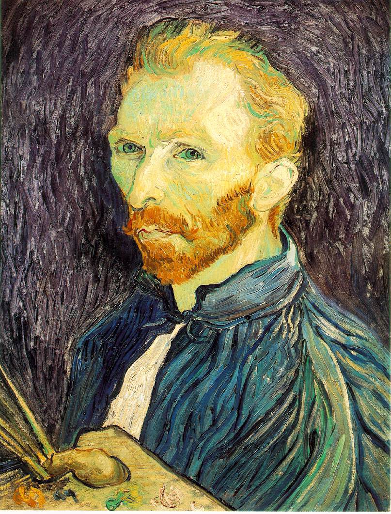 |
| Vincent van Gogh Self Portrait 1889 Oil on canvas 25 1/2 X 21 1/4 in |


I chose the three inspirational pieces that I chose because each of them were different. Although they are all self portraits, each artist approached it differently. As I have mentioned before in previous blogs, I have chosen to use pencil because it is the medium that I am most familiar with and that I find easiest to use. The most challenging part of creating a self portrait for me was getting it to look like me! I guess the way I addressed that challenge was by erasing and redrawing my lines until it looked more like the original picture.
I would say that this piece represents me in its simplicity. Also, the fact that I chose pencil represents my continuous changing quality. What I mean by that is that pencil is a medium you can always go back and alter. It is similar to the way I am as a person. I am a constant work in progress. I always look for things I can go back and change or improve upon as a person. I tried to apply the principle of value and emphasis in this picture by shading certain areas. I wanted to stay true to the shadows of certain lines in my face.
I don't think I did too bad and I'm fairly pleased with the finish product. I know it doesn't look exactly like me, but if I were to continue working on it over time, I think it would improve. Not bad for a first attempt I would say.
Art Criticism Article
Before choosing which exhibit I wanted to criticize, I looked at four of my peers projects. The four projects I reviewed were I Want to be Inspired by Joanna Limpert, Project # 4, by Tara Boliard, What a "Colorful" World: A look at Pop Art by Shawkimah Jordan and Nature Through Our Eyes: How humans see and perceive the natural world around us by Tracy-Anne King. I had a hard time choosing between Jordan and King, so I critiqued both of them!
I selected the two of them because I really enjoyed their presentations. Each of them did an excellent job choosing artwork that really suited their themes. Their exhibits also had good aesthetics. They also gave good descriptions of the art and why they chose their pieces.
I wouldn't say that I found anything specific to be difficult when writing my article. I just wrote what i honestly felt and though about their work. I think I would like to read the articles my peers wrote about my project to see what I could have done better. As far as my article goes, I would give it an 8 on a scale of 1-10. I know it wasn't perfect, but i think my comments were fair and relevant to the assignment.
Overall, I did enjoy working on this project. However, it was difficult finding enough images to make up the 20 slides.
Wednesday, August 10, 2011
Art Criticism Video Blog
In the "Greenburg on Pollock" video talked a lot about the artist. The background information it gave was very key. If I were to be creating an exhibit that included works of this artist, this is the type of stuff I would want to know. They spoke a lot of t Pollock's attitude towards eisel paintings. That would make me take into consideration what type of works I would place near his work out of respect for the artist.
"The Critics: Stories from the Inside Pages" gave a lot of insight on the role critics play. One gentleman said something along the lines of "your're helping the art of your time to gain new readers." I felt that statement was true to what our role as curators was in the last project. We had to become critics oursleves first, so that we could productively select works to display in our exhibits. The way in which we display the works as curators is crucial to how it will be read and criticized by its viewers. Critics are the ones that get us to stop and look at things. But as curators we have to think ahead of the critics and think like them. Essentially curators have to keep the critics happy. Otherwise it can affect the view they have on the work of the artist being displayed.
In "The Colonial Encounter" video was also very interesting. This video talked about art that has been ignored. A great way for people to be exposed to these rare arts would be for curators to research them and create exhibits using that art. I think that when curators try to go outside the realms of what is already familiar in the art world that a door to a whole new world can be opened.
Sunday, August 7, 2011
Art Curator Project
Well...This was a very tough task for me but I did it! At first I thought I should expect to run into some difficulty finding images to fit the theme of time. But I wasn't expecting it to be this difficult! The thing that was the hardest was to find enough images. Also, as I got farther into the project there were fewer options and less information available on those specific works.
Overall, I feel I did fairly well. I wanted to make sure that I didn't just chose works with the obvious representation of time. I wanted to chose pieces that would really make the viewer think about it. I also had to think anout the background I chose to use in my power point. Although it was not a real exhibit, I found that certain colors and patterns made it difficult to see or focus on the images. Therefore, I chose a soft gray for the template background.
Overall, I feel I did fairly well. I wanted to make sure that I didn't just chose works with the obvious representation of time. I wanted to chose pieces that would really make the viewer think about it. I also had to think anout the background I chose to use in my power point. Although it was not a real exhibit, I found that certain colors and patterns made it difficult to see or focus on the images. Therefore, I chose a soft gray for the template background.
Wednesday, August 3, 2011
Art Exhibition Project Videos
The first video about lowbrown art ties in nicely to the project. They explained what the term means and where it came from, then you could see art that would be placed in that category.Also, the descriptions being given were done by gallery curators, whic is essentially the role we will be playing in the creation of our projects. It kind of helped serve as another example of a theme that could be used for this project.
The second video spoke specifically about the approach the Tate curators use in their form of displaying art. They created four different sections each with a specific them to display the works. These themes were also displayed consisting of artworks of different time periods as well as materials and artists.
OK...The video about the Native American bones was very informational, but bored me to death. I couldn't quite make the connection to the project with this one and had a hard time focusing on what was going on.
I liked the video about the George Eastman House. I live in Rochester, NY and have been there many times. The theme of the collections in this museum are film and photography. The video was another supplement to the idea of different themes that we could develop as curators for our projects, as well as the process that is gone through in doing so.
Friday, July 29, 2011
Modern and Postmodern
I chose the video titled "Uncertainty:Modernidity and Art" because as I have read and from my personal experiences, it was evident that the modernidity of art can sometimes confuse the viewer. This is because modern art communicates so many different things. There no longer is one simple code that we follow with art. I like how the video goes into depth discussing the many uncertainties created by our modern art. One key point that stuck with me from this video was that "modern art never stops changing, but keeps keeps responding to the same problem, modern living."
The second video I chose was "Andy Warhol: Images of an Image" because I found the idea suggested by this title to be interesting and was curious to find out what it referred to. This video discussed the many techniques and works of Andy Warhol. He did a lot of works where he repeated images, a lot of which were commercial advertisements and celebrities. He was well known for his silk screens such as the work titled "Ten Lizes."
The second video I chose was "Andy Warhol: Images of an Image" because I found the idea suggested by this title to be interesting and was curious to find out what it referred to. This video discussed the many techniques and works of Andy Warhol. He did a lot of works where he repeated images, a lot of which were commercial advertisements and celebrities. He was well known for his silk screens such as the work titled "Ten Lizes."
Subscribe to:
Comments (Atom)